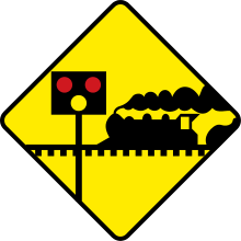
Traffic sign
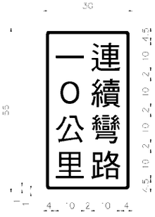
Traffic signs or road signs are signs erected at the side of or above roads to give instructions or provide information to road users. The earliest signs were simple wooden or stone milestones. Later, signs with directional arms were introduced, for example, the fingerposts in the United Kingdom and their wooden counterparts in Saxony.
With traffic volumes increasing since the 1930s, many countries have adopted pictorial signs or otherwise simplified and standardized their signs to overcome language barriers, and enhance traffic safety. Such pictorial signs use symbols (often silhouettes) in place of words and are usually based on international protocols. Such signs were first developed in Europe, and have been adopted by most countries to varying degrees.
Categories
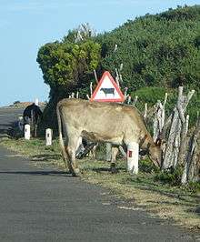
Traffic signs can be grouped into several types. For example, Annexe 1 of the Vienna Convention on Road Signs and Signals (1968), which on 30 June 2004 had 52 signatory countries, defines eight categories of signs:
- A. Danger warning signs
- B. Priority signs
- C. Prohibitory or restrictive signs
- D. Mandatory signs
- E. Special regulation signs
- F. Information, facilities, or service signs
- G. Direction, position, or indication signs
- H. Additional panels
In the United States, Canada, Ireland, Australia, and New Zealand signs are categorized as follows:
- Regulatory signs
- Warning signs
- Guide signs
- Street name signs
- Route marker signs
- Expressway signs
- Freeway signs
- Welcome signs
- Informational signs
- Recreation and cultural interest signs
- Emergency management (civil defense) signs
- Temporary traffic control (construction or work zone) signs
- School signs
- Railroad and light rail signs
- Bicycle signs
In the United States, the categories, placement, and graphic standards for traffic signs and pavement markings are legally defined in the Federal Highway Administration's Manual on Uniform Traffic Control Devices as the standard.
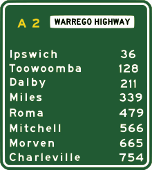
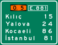
A rather informal distinction among the directional signs is the one between advance directional signs, interchange directional signs, and reassurance signs. Advance directional signs appear at a certain distance from the interchange, giving information for each direction. A number of countries do not give information for the road ahead (so-called "pull-through" signs), and only for the directions left and right. Advance directional signs enable drivers to take precautions for the exit (e.g., switch lanes, double check whether this is the correct exit, slow down). They often do not appear on lesser roads, but are normally posted on expressways and motorways, as drivers would be missing exits without them. While each nation has its own system, the first approach sign for a motorway exit is mostly placed at least 1000 m from the actual interchange. After that sign, one or two additional advance directional signs typically follow before the actual interchange itself.
History
Year of 1686. His Majesty commands all coaches, carriages and litters coming from Salvador's entrance to back up to the same part

The earliest road signs were milestones, giving distance or direction; for example, the Romans erected stone columns throughout their empire giving the distance to Rome. In the Middle Ages, multidirectional signs at intersections became common, giving directions to cities and towns.
In 1686, the first known Traffic Regulation Act in Europe is established by King Peter II of Portugal. This act foresees the placement of priority signs in the narrowest streets of Lisbon, stating which traffic should back up to give way. One of these signs still exists at Salvador street, in the neighborhood of Alfama.
The first modern road signs erected on a wide scale were designed for riders of high or "ordinary" bicycles in the late 1870s and early 1880s. These machines were fast, silent and their nature made them difficult to control, moreover their riders travelled considerable distances and often preferred to tour on unfamiliar roads. For such riders, cycling organizations began to erect signs that warned of potential hazards ahead (particularly steep hills), rather than merely giving distance or directions to places, thereby contributing the sign type that defines "modern" traffic signs.
The development of automobiles encouraged more complex signage systems using more than just text-based notices. One of the first modern-day road sign systems was devised by the Italian Touring Club in 1895. By 1900, a Congress of the International League of Touring Organizations in Paris was considering proposals for standardization of road signage. In 1903 the British government introduced four "national" signs based on shape, but the basic patterns of most traffic signs were set at the 1908 International Road Congress in Paris. In 1909, nine European governments agreed on the use of four pictorial symbols, indicating "bump", "curve", "intersection", and "grade-level railroad crossing". The intensive work on international road signs that took place between 1926 and 1949 eventually led to the development of the European road sign system. Both Britain and the United States developed their own road signage systems, both of which were adopted or modified by many other nations in their respective spheres of influence. The UK adopted a version of the European road signs in 1964 and, over past decades, North American signage began using some symbols and graphics mixed in with English.
Over the years, change was gradual. Pre-industrial signs were stone or wood, but with the development of Darby's method of smelting iron using coke, painted cast iron became favoured in the late 18th and 19th centuries. Cast iron continued to be used until the mid-20th century, but it was gradually displaced by aluminium or other materials and processes, such as vitreous enamelled and/or pressed malleable iron, or (later) steel. Since 1945 most signs have been made from sheet aluminium with adhesive plastic coatings, these are normally retroreflective for nighttime and low-light visibility. Before the development of reflective plastics, reflectivity was provided by glass reflectors set into the lettering and symbols.
New generations of traffic signs based on electronic displays can also change their text (or, in some countries, symbols) to provide for "intelligent control" linked to automated traffic sensors or remote manual input. In over 20 countries, real-time Traffic Message Channel incident warnings are conveyed directly to vehicle navigation systems using inaudible signals carried via FM radio, 3G cellular data and satellite broadcasts. Finally, cars can pay tolls and trucks pass safety screening checks using video numberplate scanning, or RFID transponders in windshields linked to antennae over the road, in support on-board signalling, toll collection and travel time monitoring.
Yet another "medium" for transferring information ordinarily associated with visible signs is RIAS (Remote Infrared Audible Signage), e.g., "talking signs" for print-handicapped (including blind/low-vision/illiterate) people. These are infra-red transmitters serving the same purpose as the usual graphic signs when received by an appropriate device such as a hand-held receiver or one built into a cell phone.
North America, Australia and New Zealand
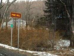
Color schemes
The North American, Australian and New Zealand colors normally have these meanings:
- red with white for stop signs, yield, and forbidden actions (such as No Parking)
- green with white letters for informational signs, such as directions, distances, and places
- brown with white letters for signs to parks, historic sites, ski areas, forests, and campgrounds
- blue with white symbols (or business logos) for rest areas, food, gasoline, hospitals, lodging, and other services
- white with black (or red) letters for regulatory signs, such as speed limits (or parking)
- yellow with black letters and symbols for warning signs, such as curves and school zones
- orange with black letters for temporary traffic control zones and detours associated with road construction[1]
- purple for "lanes restricted to use only by vehicles with registered electronic toll collection (ETC) accounts",[2] such as EZPass.
- black with white letters or arrows for lane use.[3]
The US Manual on Uniform Traffic Control Devices prescribes four other colors: [2]
- fluorescent yellow-green with black symbols for school zone, school bus stop, pedestrian, playground, and bicycle warning signs
- fluorescent pink with black letters and symbols for incident management signs
- coral and light blue, which are unassigned but reserved for potential future use.
Regulatory signs are also sometimes seen with white letters on red or black signs. In Quebec, blue is often used for public services such as rest areas; many black-on-yellow signs are red-on-white instead.
Many US states and Canadian provinces now use fluorescent orange for construction signs.[4]
Highway symbols and markers
Every state and province has different markers for its own highways, but use standard ones for all federal highways. Many special highways – such as the Queen Elizabeth Way, Trans-Canada Highway, and various auto trails in the U.S. – have used unique signs. Counties in the US sometimes use a pentagonal blue sign with yellow letters for numbered county roads, though the use is inconsistent even within states.
Units
Distances on traffic signs generally follow the measurement system in use locally: that is to say, the metric system in all countries of the world except Burma, Liberia, the United Kingdom, and the United States – although the metric system is used in the UK for all purposes other than the display of road distances and the defining of speed limits, and in the US the Federal Department of Transportation has developed (very rarely used) metric standards for all signs.
Languages
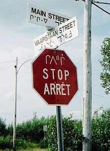
Where signs use a language, the recognized language/s of the area is normally used. Signs in most of the US, Canada, Australia, and New Zealand are in English. Quebec uses French, while New Brunswick and the Jacques-Cartier and Champlain bridges, in Montreal (as well as some parts in the West Island), use both English and French, and a number of other provinces and states, such as Ontario, Manitoba, and Vermont use bilingual French–English signs in certain localities. Puerto Rico (a US territory), Mexico, and Spain use Spanish. Within a few miles of the US–Mexico border, road signs are often in English and Spanish in places like San Diego, Yuma, and El Paso. Indigenous languages, mainly Nahuatl as well as some Mayan languages, have been used as well.
Typefaces
The typefaces predominantly used on signs in the US and Canada are the FHWA alphabet series (Series B through Series F and Series E Modified). Details of letter shape and spacing for these alphabet series are given in "Standard Alphabets for Traffic Control Devices", first published by the Bureau of Public Roads (BPR) in 1945 and subsequently updated by the Federal Highway Administration (FHWA). It is now part of Standard Highway Signs (SHS), the companion volume to the MUTCD which gives full design details for signfaces.
Initially, all of the alphabet series consisted of uppercase letters and digits only, although lowercase extensions were provided for each alphabet series in a 2002 revision of SHS. Series B through Series F evolved from identically named alphabet series which were introduced in 1927.
Straight-stroke letters in the 1927 series were substantially similar to their modern equivalents, but unrounded glyphs were used for letters such as B, C, D, etc., to permit more uniform fabrication of signs by illiterate painters. Various state highway departments and the federal BPR experimented with rounded versions of these letters in the following two decades.
The modern, rounded alphabet series were finally standardized in 1945 after rounded versions of some letters (with widths loosely appropriate for Series C or D) were specified as an option in the 1935 MUTCD and draft versions of the new typefaces had been used in 1942 for guide signs on the newly constructed Pentagon road network.
The mixed-case alphabet now called Series E Modified, which is the standard for destination legend on freeway guide signs, originally existed in two parts: an all-uppercase Series E Modified, which was essentially similar to Series E, except for a larger stroke width, and a lowercase-only alphabet. Both parts were developed by the California Division of Highways (now Caltrans) for use on freeways in 1948–1950.
Initially, the Division used all-uppercase Series E Modified for button-reflectorized letters on ground-mounted signs and mixed-case legend (lowercase letters with Series D capitals) for externally illuminated overhead guide signs. Several Eastern turnpike authorities blended all-uppercase Series E Modified with the lowercase alphabet for destination legends on their guide signs.
Eventually, this combination was accepted for destination legend in the first manual for signing Interstate highways, which was published in 1958 by the American Association of State Highway Officials and adopted as the national standard by the BPR.
Uses of non-FHWA typefaces
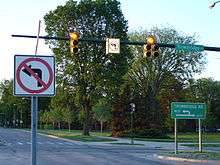
The US National Park Service uses NPS Rawlinson Roadway, a serif typeface, for guide signage; it typically appears on a brown background. Rawlinson has replaced Clarendon as the official NPS typeface, but some states still use Clarendon for recreational signage.
Georgia, in the past, used uppercase Series D with a custom lowercase alphabet on its freeway guide signs; the most distinctive feature of this typeface is the lack of a dot on lowercase i and j.[5] More recent installations appear to include the dots.[6]
The Clearview typeface, developed by US researchers to provide improved legibility, is permitted for light legend on dark backgrounds under FHWA interim approval. Clearview has seen widespread use by state departments of transportation in Arkansas, Arizona,[7] Illinois,[8] Kentucky, Maryland, Michigan, Ohio, Pennsylvania, Texas, and Virginia. The Kansas Turnpike Authority has also introduced Clearview typeface to some of its newer guide signs along the Kansas Turnpike, but the state of Kansas continues to use the FHWA typefaces for signage on its non-tolled Interstates and freeways.
In Canada, the Ministry of Transportation for the Province of British Columbia specifies Clearview for use on its highway guide signs,[9] and its usage has shown up in Ontario on the Don Valley Parkway and Gardiner Expressway in Toronto and on new 400-series highway installations in Hamilton, Halton and Niagara, as well as street signs in various parts of the province. The font is also being used on newer signs in Alberta, Manitoba, and Quebec.
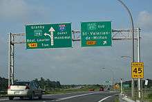
It is common for local governments, airport authorities, and contractors to fabricate traffic signs using typefaces other than the FHWA series; Helvetica, Futura and Arial are common choices.
New Zealand
New Zealand road signs are generally influenced both by American and European practices.
Warning signs are diamond-shaped with a yellow background for permanent warnings, and an orange background for temporary warnings. They are somewhat more pictorial than their American counterparts. This is also true for Canadian signage.
Regulatory signs also follow European practice, with a white circle with a red border indicating prohibitive actions, and a blue circle indicating mandatory actions. White rectangular signs with a red border indicate lane usage directions. Information and direction signs are rectangular, with a green background indicating a state highway, a blue background for all other roads and all services (except in some, where directional signage is white), and a brown background for tourist attractions.
Before 1987, most road signs had black backgrounds – diamonds indicated warnings, and rectangles indicated regulatory actions (with the exception of the Give Way sign (an inverted trapezium), and Stop sign and speed limit signs (which were the same as today)). Information signs were yellow, and direction signage was green on motorways and black everywhere else.
Europe
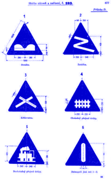
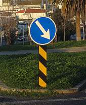
Since the signing of the 1931 Geneva Convention concerning the Unification of Road Signals by a number of countries that the standardization of the traffic signs started in Europe. The 1931 Convention rules were developed in the 1949 Geneva Protocol on Road Signs and Signals.
In 1968, the European countries signed the Vienna Convention on Road Traffic treaty, with the aim of standardizing traffic regulations in participating countries in order to facilitate international road traffic and to increase road safety. Part of the treaty was the Vienna Convention on Road Signs and Signals, which defined the traffic signs and signals. As a result, in Western Europe the traffic signs are well standardized, although there are still some country-specific exceptions, mostly dating from the pre-1968 era.
The principle of the European traffic sign standard is that certain shapes and colours are to be used with consistent meanings:
- Triangular signs (black symbols on a white or yellow background) warn of dangers. The Vienna Convention additionally allows an alternative shape for such signs, namely a right-angled diamond – although in Europe this shape is regularly used only in the Republic of Ireland.
- Regulatory signs are round: those indicating a prohibition or limit are black on white (or yellow) with a red border; those giving a mandatory order are white on blue.
- Informational and various other secondary signs are of rectangular shape.
- The animals which may be depicted on warning signs include cattle, deer, ducks, elk, frogs, horses, sheep, monkeys (in Gibraltar), and polar bears (on Svalbard). The Convention allows any animal image to be used.
Directional signs ("guide signs" in American parlance) have not been harmonized under the Convention, at least not on ordinary roads. As a result, there are substantial differences in directional signage throughout Europe. Differences apply to the choice of typeface, arrows and, most notably, colours. The convention does, however, specify that the type of directional signage used should, for each country, distinguish limited-access roads ("motorways") from ordinary, all-purpose roads.
Directional signage on motorways uses:
- white-on-green in, for example, Albania, Bosnia and Herzegovina, Bulgaria, Croatia, Cyprus, the Czech Republic, Denmark, Finland, Greece, Italy, the Republic of Macedonia, Romania, Serbia, Slovakia, Slovenia, Sweden, Switzerland, and Turkey
- white-on-blue in, for example, Austria, Belarus, Belgium, France, Germany, Hungary, Luxembourg, the Netherlands, Norway, Poland, Portugal, the Republic of Ireland, Spain, and the United Kingdom.
Differences are greater for non-motorways:
- White-on-blue in Italy, Switzerland, Sweden, the Czech Republic, Greece, Cyprus, Slovakia, Bulgaria, Romania, Latvia, Estonia, Finland, Turkey, and the Netherlands (in this case the same as on motorways).
- White-on-green in the United Kingdom, the Republic of Ireland, Poland, France, and Portugal (only on the few primary roads that still have not been transformed in motorways),
- Black-on-yellow in Bosnia and Herzegovina, Germany, Luxembourg, Norway, Slovenia, Serbia, and Croatia.
- Red-on-white in Denmark (though white-on-blue on motorway exits and all overhead gantries)
- Black-on-white in Spain.[10]
The black-on-white signposting of secondary roads distinguishes them from primary roads in Finland, France, Portugal, the Republic of Ireland, Switzerland, and the United Kingdom. In Germany, Italy, Romania, and Sweden black-on-white indicates urban-only roads or urban destinations.
The signposting of road numbers also differs greatly, except that European route numbers, if displayed, are always indicated using white characters on a green rectangle. European route numbers are, however, not signed at all in the United Kingdom.
The Convention recommends that certain signs – such as "STOP", "ZONE", etc. – be in English; however, use of the local language is also permitted. If a language uses non-Latin characters, a Latin-script transliteration of the names of cities and other important places should also be given. Road signs in the Republic of Ireland are bilingual, using Irish and English. Wales similarly uses bilingual Welsh–English signs, while some parts of Scotland have bilingual Scottish Gaelic–English signs. Finland also uses bilingual signs, in Finnish and Swedish. Signs in Belgium are in French, Dutch, or German depending on the region. In the Brussels Capital Region, road signs are in both French and Dutch. Signs in Switzerland are in French, German, or Italian depending on the canton.
European countries – with the notable exception of the United Kingdom, where distances and lengths are indicated in miles, yards, feet, and inches, and speed limits are expressed in miles per hour – use the metric system on road signs.
For countries driving on the left, the convention stipulates that the traffic signs should be mirror images of those used in countries driving on the right. This practice, however, is not systematically followed in the four European countries driving on the left, Cyprus, Malta, the Republic of Ireland, and the United Kingdom. The convention permits the use of two background colours for danger and prohibition signs: white or yellow. Most countries use white, with a few – such as Finland, Iceland, Poland, and Sweden – opting for yellow as this tends to improve the winter-time visibility of signs in areas where snow is prevalent. In some countries, such as France, white is the normal background colour for such signs, but yellow is used for temporary signage (as, for example, at road works).
European traffic signs have been designed with the principles of heraldry in mind; i.e., the sign must be clear and able to be resolved at a glance. Most traffic signs conform to heraldic tincture rules, and use symbols rather than written texts for better semiotic clarity.
Croatia
Croatian road signs follow the Vienna convention (SFR Yugoslavia was the original signatory for Croatia, which is now a contracting party itself). The most common signs are:
- Yellow and black signs for direction.
- Blue and white signs for information.
- White-on-green signs are used on the highways.
In the first years following Croatia's independence, its traffic signs were the same as in the rest of the former Yugoslavia. In the early 2000s, replacement of the yellow background of warning signs began, and new signs now use a white background.
The signage typeface is SNV, as with the other countries of the former Yugoslavia.
Iceland
Road signs in Iceland mainly follow the Vienna Convention, but use a variant of the colour scheme and minor design changes similar to the signs in Sweden.
Ireland

Until the partition of Ireland in 1922 and the independence of the Irish Free State (now the Republic of Ireland), British standards applied across the island. In 1926 road sign standards similar to those used in the UK at the time were adopted.[11] Law requires that the signs be written in both Irish and English.
In 1956, road signs in the Republic were changed from the UK standard with the adoption of US-style "diamond" signs for many road hazard warnings (junctions, bends, railway crossings, traffic lights).[12] Some domestic signs were also invented, such as the keep-left sign (a black curved arrow pointing to the upper-left, although some are similar to the European "white arrow on blue disk" signs), while some other signs are not widely adopted outside Ireland, such as the no-entry sign (a black arrow pointing ahead in a white circle with a red slashed circumference).
Directional signage is similar to current United Kingdom standards. The same colours are used for directional signs in Ireland as in the UK, and the UK Transport and Motorway fonts are used. Unlike Wales and Scotland, where Welsh and Gallic place-names use the upright Transport face, Irish place-names are rendered in an italic face.
In January 2005 Ireland adopted metric speed limits. Around 35,000 existing signs were replaced and a further 23,000 new signs erected bearing the speed limit in kilometres per hour. To avoid confusion with the old signs, each speed limit sign now has "km/h" beneath the numerals. Also, since the adoption of signs based on the Warboys Committee standard in 1977, Irish directional signs have used the metric system, however, unlike with the later speed limit change over, there was no effort made to change the existing signage, and as of 2007 many finger posts still remain on rural roads with distances in miles, although the numbers continue to decline as roads are improved.
In late 2007 Ireland began an extensive programme of sign and post replacement. Good examples are the M1 (Dublin–Dundalk) and the M50 (Dublin). While being mostly the same as the old signs, it is welcome as a lot of the signs were damaged/stained. About half of the new posts are now two medium posts with crosshatched metal posts in-between instead of one large pole to minimise the damage in case of a crash.
Latvia
Road signs in Latvia largely adhere to Vienna Convention guidelines. In detailed design they closely resemble the signs used in Germany.
Netherlands
Road signs in the Netherlands follow the Vienna Convention. Directional signs (which have not been harmonized under the Convention) always use blue as the background colour. The destinations on the sign are printed in white. If the destination is not a town (but an area within town or some other kind of attraction), that destination will be printed in black on a separate white background within the otherwise blue sign.
The Netherlands always signposts European road numbers where applicable (i.e., on the advance directional signs, the interchange direction signs and on the reassurance signs). Dutch national road numbers are placed on a rectangle, with motorways being signposted in white on a red rectangle (as an Axx) and primary roads in black on a yellow rectangle (as Nxx). When a motorway changes to a primary road, its number remains the same, but the A is replaced by the N. So at a certain point the A2 becomes N2, and when it changes to a motorway again, it becomes A2 again.
Signs intended for bike-riders always go on white signs with red or green letters.
The Dutch typeface, known as ANWB-Ee, is based on the US typeface. A new font, named ANWB-Uu (also known as Redesign), has been developed in 1997 and appears on many recent Dutch signs. On the motorways however the typeface remains the ANWB-Ee or a similar typeface. The language of the signs is typically Dutch, even though bilingual signs may be used, when the information is relevant for tourists.
Norway

Signs in Norway mostly follow the Vienna Convention, except the polar bear warning sign, which is a white bear on a black background and a red border. These are the directional signs:
- Signs for motorways are blue with white text
- Those for regular roads to towns and cities are yellow with black lettering
- Signs for industrial areas, commercial facilities etc. are white with black letters
- Signs for tourist attractions, national parks, museums etc. are brown with white lettering
The signs for road numbering are rectangular, and have this colour scheme:
- European routes (E6,E18,etc.)are green with white lettering
- National routes are also green with white lettering
- County owned roads are white with black lettering
- Municipality owned roads have the name of the road, instead of a number, and are white with black lettering
Sweden
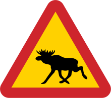
The road signs in Sweden mostly follow the Vienna Convention with a few adaptations, however, allowed within the convention:
- The background of warning signs is yellow
- Warning signs for elk and reindeer
- The background of direction signs is blue with white text
- The background of motorway direction signs is green with white text
- When applicable, the language is Swedish in Sweden.
The signage typeface Tratex is used exclusively in Sweden and is available as freeware.[13]
United Kingdom

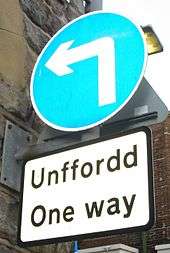
Traffic signing in the UK conforms broadly to European norms, though a number of signs are unique to Britain and direction signs omit European route numbers. The current sign system, introduced on 1 January 1965, was developed in the late 1950s and early 1960s by the Anderson Committee, which established the motorway signing system, and by the Worboys Committee, which reformed signing for existing all-purpose roads. (For illustrations of most British road signs, see 'Know your traffic signs'[14] on the GOV.UK website.)
The UK remains the only European Union member nation and the only Commonwealth country to use non-metric (Imperial) measurements for distance and speed, although "authorised weight" signs have been in metric tonnes since 1981 and there is currently a dual-unit (metric first) option for height and width restriction signage, intended for use on safety grounds. On motorways kilometre signs are visible at intervals of 500 m indicating the distance from the start of the motorway. (See Driver location sign).
Three colour schemes exist for direction signs:
- On motorways they are blue with white lettering
- On primary routes they are green with white lettering and yellow route numbers
- A non-primary route has white signs with black lettering
- A fourth colour scheme, black on yellow, is seen on temporary signs, for example marking a diversionary route avoiding a road closure.
Two typefaces are specified for British road signs. Transport "Medium" or Transport "Heavy" are used for all text on fixed permanent signs and most temporary signage, depending on the colour of the sign and associated text colour; dark text on a white background is normally set in "Heavy" so that it stands out better. However route numbers on motorway signs use a taller limited character set typeface called "Motorway".
Signs are generally bilingual in all parts of Wales (English/Welsh or Welsh/English), and similar signs are beginning to be seen in parts of the Scottish Highlands (English/Scottish Gaelic).
All signs and their associated regulations can be found in the Traffic Signs Regulations and General Directions,[15] as updated by the TSRGD 2008 and TSRGD 2011 and complemented by the various chapters of the "Traffic Signs Manual".
Mexico, South and Central America
Road signs in Mexico, Central America, and South America vary from country to country. For the most part, conventions in signage tend to resemble United States signage conventions more so than European and Asian conventions. For example, warning signs are typically diamond-shaped and yellow rather than triangular and white. Some variations include the "Parking" and "No Parking" signs, which contain either a letter E or P, depending on which word is used locally for "Parking" (Spanish estacionamiento or parqueo, Portuguese estacionamento), as well as the Stop sign, which usually reads "Pare" or "Alto". Notable exceptions include speed limit signs, which follow the European conventions, and the "No Entry" sign, often replaced with a crossed upwards arrow.
Colombia
Traffic signs in Colombia are classified into three categories:
- Warning signs
- Mandatory signs
- Information signs.[16]
Warning signs are very similar to warning signs in United States. They are yellow diamond-shaped with a black symbol (the yellow colour is changed to an orange colour in areas under construction). In certain cases, the yellow colour is shifted to fluorescent yellow (in the School area sign and Chevron sign).
Mandatory signs are similar to European signs. They are circular with a red border, a white background and a black symbol. Stop sign and Yield sign are as European, except the word "Stop" is changed for "Pare" and the Yield sign has no letters, it is a red triangle with white centre.
Information signs have many shapes and colours. Principally they are blue with white symbols and in many cases these signs have an information letter below the symbol.
Africa
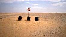
Mauritius
Road signs in Mauritius are regulated by the Traffic Signs Regulations 1990; they are particularly modelled on the United Kingdom road signs since Mauritius is a former British colony. Mauritius has left-hand traffic.
Asia
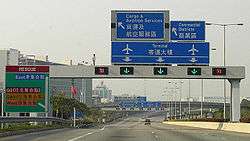

China
- Warning signs in China are triangular with a black border, yellow background and black symbol.
- Mandatory signs generally follow European conventions (circular with red border/blue circle) with some local variations.
Direction signs are:
- Green for expressways
- Brown for tourist attractions
- And blue for other roads.
- Occasionally black on white is used for directions to local facilities.
Hong Kong
Hong Kong's traffic signs follow the type of United Kingdom and are bi-lingual in English and Chinese (English on top, and Traditional Chinese characters at the bottom).
India
Indonesia
Iran
Road signs in Iran mainly follow the Vienna Convention. Signs are in Persian and English.
Israel
Road signs in Israel mainly follow the Vienna Convention, but have some variants.
Japan
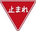
Road signs in Japan are either controlled by local police authorities under Road Traffic Law (道路交通法 Dōro Kōtsūhō) or by other road-controlling entities including Ministry of Land, Infrastructure, Transport and Tourism, local municipalities, NEXCO (companies controlling expressways), under Road Law (道路法 Dōrohō). Most of the design of the road signs in Japan are similar to the signs on the Vienna Convention, except for some significant variances, such as stop sign with a red downward triangle. The main signs are categorized into four meaning types:
- Guidance (white characters on blue in general – on green in expressways),
- Warning (black characters and symbols on yellow diamond),
- Regulation (red or blue circle, depending on prohibition or regulation),
- And instruction (mostly white characters or symbols on blue square).
Pakistan
Philippines
_sign.svg.png)
Road signs in the Philippines are standardized in the Road Signs and Pavement Markings Manual, published by the Department of Public Works and Highways. Philippine road signage practice closely follow the Vienna Convention, but with local adaptations and some minor influences from the US MUTCD and Australian road signs. However, some road signs may differ by locale, and mostly diverge from the national standard. For example, the Metropolitan Manila Development Authority (MMDA) has used pink and light blue in its signage for which it has been heavily criticised.[17][18]
Road signs in the Philippines are classified as:
- Regulatory signs
- Warning signs
- Guide signs
- Expressway signs
- Traffic instruction signs
Regulatory road signs – other than the stop and give way signs – are generally circular, with (for prohibitions) a black symbol on a white background within a red border, or (for mandatory instructions) a white symbol on a blue background. In some cases circular regulatory signs are placed on white rectangular panels together with text supplementing their meanings.
Most warning signs display a black symbol on a white background within a red-bordered equilateral triangle. Since 2012, however, a more visibly distinctive design (taken from that used for school signs in the US) has been adopted for pedestrian-related signs: these consist of a fluorescent yellow-green pentagon with black border and symbol. Additional panels may be placed below signs to supplement their meanings.
Guide signs are divided into directional signs, service area signs, route markers, and tourist-related signs, with influence from both American and Australian practice. Directional signs use a green background with white letters and arrows. Service area signs use a blue background with white letters, arrows, and symbols. Tourist-related signs use a brown background with white letters, arrows, and symbols. The route marker sign, excluding the AH26 route marker, is based on the Australian National Route marker, but reserved for future use.
Signs on expressways mostly take elements from Australian motorway/freeway signs. Exit signs, wrong way signs and start/end of expressway signs are very similar to Australian freeway signage. Traffic instruction signs are textual signs used to supplement warning and regulatory signs.
Singapore
Singapore's traffic signs closely follow British road sign conventions, although the government has introduced some changes to them.
Sri Lanka
Road signs in Sri Lanka are standardized road signs closely follow those used in the United Kingdom with certain distinctions, and a number of changes have introduced road signs that suit as per local road and system. Sri Lankan government announced by a gazette that aimed to get a face-lift and introduction of over 100 new road traffic signs.
Automatic traffic sign recognition
Cars are beginning to feature cameras with automatic traffic sign recognition, beginning with the Opel Insignia. It mainly recognizes speed limits and no-overtaking areas.[19]
Street sign theft
Street sign theft occurs when street signs are stolen, often to be used as decorations, but also sometimes to avoid obeying the law by claiming later the sign was not there. Although the theft often seems arbitrary, signs that are unusual or amusing tend to be stolen more frequently. Sometimes considered to be a prank by the perpetrators, the theft is often costly and inconveniencing for the municipality or agency that owns the sign. In the United States, each street sign generally costs between $100 and $500 to replace.[20][21]
Popular culture can act as a catalyst to street sign theft. Bands such as The Beatles and Lynyrd Skynyrd have exacerbated street sign theft as their songs and albums include real place names including Penny Lane, Blue Jay Way, Abbey Road, and Brickyard Road.
A provocative street name or other name on the sign can also trigger thefts. Well-known examples include Ragged Ass Road in Yellowknife, Northwest Territories, Butt Hole Road in Conisbrough, Doncaster, England and Sodom off the B5429 in Denbighshire, Wales.
See also
- Button copy
- Comparison of European traffic signs
- Comparison of MUTCD-Influenced Traffic Signs
- Duck crossing
- Exit number
- Fingerpost
- List of public signage typefaces
- Off-Network Tactical Diversion Route
- Road surface marking
- Road marking machine
- Rules of the road
- Street sign theft
- Tourist sign
- Traffic light
- Traffic sign design
Gallery
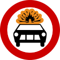 Road sign in Greece: no vehicles carrying explosives or flammable goods
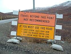 Sign north of Nome, Alaska, providing warning of the remote, unpopulated area beyond
 Traffic sign in Jordan
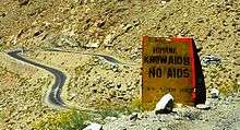 "Know AIDS - No AIDs". Nubra Valley, Ladakh, India
 "After Whiskey Driving Risky". Lahaul, India
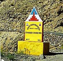 "If Married Divorce Speed". Ladakh, India
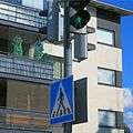 Pedestrian crossing in Finland
 Cycleway sign (white) in Finland
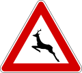 Italian road sign warning of wild animals. Germany, Latvia, Spain, Turkey, among other countries, use a very similar sign.
 Romantic Road sign in southern Germany (note the Alps in the background)
References
- ↑ "The Evolution of MUTCD". dot.gov.
- 1 2 Section 1A.12 Color Code, Manual on Uniform Traffic Control Devices
- ↑ "Signs, signals and road markings" (PDF). icbc.com.
- ↑ Section 6F.02 General Characteristics of Signs [Temporary Traffic Control], Manual on Uniform Traffic Control Devices
- ↑ "Image". gribblenation.com. Retrieved 30 November 2010.
- ↑ "Photo". gribblenation.com. Retrieved 30 November 2010.
- ↑ Holstege, Sean (11 September 2013). "Seeing double on I-17? It's a sign of safer times.". The Arizona Republic. Phoenix, Arizona, USA. Retrieved 3 December 2014.
- ↑ Illinois Department of Transportation
- ↑ 2006 Internet Templates
- ↑ "Norma 8.1-I.C." (PDF). Ministerio de Fomento, Gobierno de España.
- ↑ S.I. No. 55/1926: Road Signs and Traffic Signals Regulations, 1926 – Irish Statute Book
- ↑ S.I. No. 284/1956: Traffic Signs Regulations, 1956 - Irish Statute Book
- ↑ Teckensnitt på vägmärken / Vägverket
- ↑ https://www.gov.uk/government/publications/know-your-traffic-signs
- ↑ "The Traffic Signs Regulations and General Directions 2002". opsi.gov.uk. Retrieved 30 November 2010.
- ↑ Colombia traffic signs manual
- ↑ "MMDA defends 'pink' as traffic enforcement standard". GMA News Online.
- ↑ "Probe looms over MMDA's pink traffic signs". GMA News Online.
- ↑ "Opel Insignia to feature traffic sign recognition system".
- ↑ Church, Zach (July 29, 2007). "The cost of Vandalism: Time, frustration and cash". Eagle-Tribune.
- ↑ Moeur, Richard C. "Manual of Traffic Signs".
External links
| Wikimedia Commons has media related to Road signs. |
| Look up signpost in Wiktionary, the free dictionary. |
North America
Canada
- Government of Quebec traffic control devices library - Extensive list of all road signs and signals from the Quebec Transport Ministry (English) (French)
- Road Signs in Ontario, from the Ontario Ministry of Transportation.
- ICBC – Signs, signals and road markings from ICBC
United States
- Federal Highway Administration publications:
- Manual of Traffic Signs – private website based on the MUTCD
- Ensuring That Traffic Signs Are Visible at Night: Federal Regulations Congressional Research Service
- Traffic Signs Evolution Since 1925 to Present
Europe
- Signs and markings British traffic signs from the Highway Code
- Danish traffic signs
- securite-routiere.gouv.fr (French)
- Know Your Traffic Signs - Department for Transport (UK)
- German traffic signs and signals
- UK Road Signs
- Norma 8.,1-IC Style manual for road signs in Spain (Spanish)
Asia
- Pakistani Traffic Rules and Road Signs
- Indian Traffic Rules and Signals
- The Road User's Code: The Language of the Road by the Transport Department of the Government of the Hong Kong SAR
Typefaces
Other
- Traffic signs in Russian Federation
- A collection of street signs and traffic lights
- Photos of directional signage on motorways
- Traffic signs in Croatia
