Column (typography)

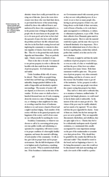
In typography, a column is one or more vertical blocks of content positioned on a page, separated by gutters (vertical whitespace) or rules (thin lines, in this case vertical). Columns are most commonly used to break up large bodies of text that cannot fit in a single block of text on a page. Additionally, columns are used to improve page composition and readability. Newspapers very frequently use complex multi-column layouts to break up different stories and longer bodies of texts within a story. Column can also more generally refer to the vertical delineations created by a typographic grid system which type and image may be positioned. In page layout, the whitespace on the outside of the page (bounding the first and last columns) are known as margins; the gap between two facing pages is also considered a gutter, since there are columns on both sides. (Any gutter can also be referred to as a margin, but exterior and horizontal margins are not gutters.)[1]
Typographic style
Column width is traditionally called measure by typesetters. For best legibility, typographic manuals suggest that columns should be wide enough to contain roughly 60 characters per line.[2] One formula suggests multiplying the point size of the font by 2 to reach how wide a column should be in picas[3] — in effect a column width of 24 ems. Following these guidelines usually results in multiple narrow columns being favored over a single wide column.[4] Historically, books containing predominantly text generally have around 40 lines per column. However, this rule of thumb does not apply to more complex text that contain multiple images or illustrations, footnotes, running heads, folios, and captions.[5]
Column contrast refers to the overall color or greyness established by the column, and can be adjusted in a number of ways. One way is to adjust the relationship between the width and height of the column. Another way is to make adjustments to the typeface, from choosing a specific font, to adjusting weight, style, size and leading. Column contrast can be used to establish hierarchy, to balance the page composition, and to visually activate areas of the page.[6]
Web layout
In web design, columns are often used to separate primary content from secondary and tertiary content. For example, a common two column layout may include a left column with navigation links, and a right column for body text. One method of creating columns for the web is to place text within an HTML table element, often with the border set to zero. However, this method is considered outdated and inaccessible to some. Another method includes using CSS to either float or position the corresponding text. These methods were not as straightforward as using HTML tables, which made a tableless three column layout a sort of holy grail once these techniques were discovered in the early 2000s.[7] More recent levels of CSS have addressed column behaviors,[8] and web browser support for these behaviors continues to improve.[9]
See also
- Column inch
- stick, roughly 1⁄10 of a column
Notes
- ↑ http://www.wisegeek.com/in-typography-what-are-gutters.htm
- ↑ Carter, 1993. p. 91
- ↑ For example, a 9pt font size would require an 18 pica column width.
- ↑ Romano, 1984. pp. 86–87
- ↑ Haslam, 2005. p. 140
- ↑ Carter, 1993. p. 51
- ↑ “CSS Layout Techniques: for Fun and Profit” glish.com Accessed 2007-12-12.
- ↑ “CSS3 module: Multi-column layout” 6 June 2007 W3.org. Accessed 2007-12-12.
- ↑ "caniuse.com" Accessed 2012-05-16.
References
- Carter, Rob. Day, Ben. Meggs, Philip. Typographic Design: Form and Communication 2nd ed. John Wiley & Sons: 1993. pp. 51–53, 90-91.
- Haslam, Andrew; Baines, Phil (2005). Type and Typography. New York, N.Y: Watson-Guptill. p. 140. ISBN 0-8230-5528-0.
- Romano, Frank J. The TypeEncyclopedia. R.R. Bowker Company: 1984. pp. 86–86.