Elephant (typeface)
 | |
| Category | Serif |
|---|---|
| Classification |
Didone Display |
| Designer(s) |
Matthew Carter Employees of Vincent Figgins |
| Foundry |
Microsoft Carter & Cone Font Bureau |
| Date created | 1992 |
| Variations | Big Figgins |
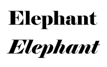
Elephant is an ultra-bold serif typeface intended for display use, designed as a digital font by British font designer Matthew Carter.[1] Elephant is a 'fat face' design, inspired by fonts intended for use for posters developed by Vincent Figgins in London in the early nineteenth century.[2][3][4]
Carter created both a roman or regular style, and an italic; as an already bold design it does not have a bold style.[lower-alpha 1] Carter based Elephant on fonts in Figgins' 1815 and 1817 specimen books.[4][6][7][8]
Releases
Elephant was published by Microsoft in 1992 for sale with some of its software, notably its TrueType Fontpack 2.[9][10][11] It was later reissued in an expanded family under the name of 'Big Figgins' from 1998 onwards.[12] This adds an 'inline' version (similar to Imprint Shadowed, but of course much bolder), in capitals only. It has been used as a titling font by the Washington Post, for which a derivative version suitable for smaller sizes was drawn.[13][14] Some versions are credited to Carter's company, Carter & Cone, run with business partner Cherie Cone, and others also through Font Bureau.[15][16] The original Microsoft release includes ligatures, but these are not automatically inserted. Big Figgins included minor changes such as a redesigned Euro sign.[11]
History and background
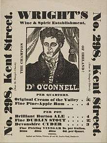
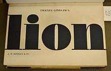
Great changes took place in the style of printed letters available from type foundries in the hundred years after 1750. At the beginning of this period, fonts in British printing were predominantly intended for book and newspaper use. Modern bold fonts did not exist (although some titling capitals were quite bold); if a bolder effect was intended blackletter might be used.
A major development of the early nineteenth century was the arrival of the printed poster and increasing use of printing for publicity and advertising material, for example in newspaper adverts. This caused a desire to make eye-catching new types of letters available for printing.[17][18][19][20] Presumably to be more striking, these new typefaces were often extremely bold.[2][3][21][22] As a result, new styles of display type began to appear which were not just larger versions of body text-oriented serif fonts.[19][23] Fat face typefaces were a part of this development, making verticals extremely, strikingly bold. Other new designs such as sans-serif ('Egyptian'), slab serif ('Antique'), and reverse-contrast ('Italian') typefaces were first created around the same time.[24][25] (The names are those given by printers, which have little actual connection to history.)
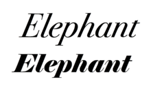
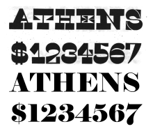
The structure of Elephant is based on Didone fonts intended for body text such as those of Didot and Bodoni and their imitators; like them it has quite flat serifs with minimal bracketing, which become curls in italic.[lower-alpha 2] These have alternating thin and thick lines with relatively slender serifs.[28] In fat faces like Elephant, the bolder lines are massively strengthened to create an overpoweringly bold effect, with a dramatic contrast between thick and thin strokes. While the style is sometimes described as 'Victorian', in fact fat faces were available on sale years before Queen Victoria was born in 1819.
Describing the Figgins typefaces and Carter's revival, Carter's friend historian James Mosley wrote:
To my mind Elephant is [an] elegant piece of draftsmanship. This may seem a curious remark, for...a "fat face" type [is] designed like a naval broadside to sock its commercial message by poster to the unconsenting reader at a distance of ten or twenty yards by sheer aggressive weight of heavy metal. The paradox of the design is that, while the thick lines were very thick, the thin ones remained the same [as in a normal weight font] - or in proportion, very thin indeed. Such exaggeration puts a huge strain on the designer if the result is to retain any coherence at all. Whoever cut the fat-faces of Vincent Figgins...handled the problems with what can only be described as elegance. Carter's homage to this unknown designer keeps most of the "ear-mark" features by which they can be distinguished from contemporary types of this kind.[4]
Similar fonts
Many similar fonts were released from British typefounders in general in the nineteenth century by companies such as the Fann Street Foundry; they remained popular, partly as Victoriana.[2][lower-alpha 3] Similar post-nineteenth century fonts include:
- Surveyor by Tobias Frere-Jones; a complete Didone type family with bold and black weights.[29]
- Ultra Bodoni by Morris Fuller Benton at American Type Founders.[30]
- Falstaff by Monotype[31]
- Normande by Berthold[32]
- Brunel by Barnes & Schwartz[33]
- Thorowgood by Linotype.[34] Name commemorates William Thorowgood, a typefounder of the time, although actually based on type by Robert Thorne.[2]
References
- ↑ Margaret Re; Johanna Drucker; James Mosley; Matthew Carter (1 July 2003). Typographically Speaking: The Art of Matthew Carter. Princeton Architectural Press. pp. 61, 84, 90. ISBN 978-1-56898-427-8.
- 1 2 3 4 Kennard, Jennifer. "The Story of Our Friend, the Fat Face". Fonts in Use. Retrieved 11 August 2015.
- 1 2 Mosley, James. "English Vernacular". Type Foundry. Retrieved 4 March 2016.
- 1 2 3 Mosley, James (2003). "Reviving the Classics: Matthew Carter and the Interpretation of Historical Models". In Mosley, James; Re, Margaret; Drucker, Johanna; Carter, Matthew. Typographically Speaking: The Art of Matthew Carter. Princeton Architectural Press. pp. 35–6. ISBN 9781568984278. Retrieved 30 January 2016.
- ↑ Stearns, Alex. "Say No to Faux Bold". A List Apart. Retrieved 4 March 2016.
- ↑ Indie Fonts. Rockport Publishers. pp. 73–5. ISBN 978-1-61059-679-4.
- ↑ Wolpe, Berthold, ed. (1967). Vincent Figgins Type Specimens, 1801 and 1815. Printing Historical Society.
- ↑ Knopp, Justin. "Type Specimens from the Vincent Figgins Type Foundry – 1815.". Typoretum. Retrieved 7 March 2016.
- ↑ "Elephant - Microsoft". Microsoft. Retrieved 4 March 2016.
- ↑ Step-by-step Graphics. Dynamic Graphics, Incorporated. 1993. p. 46.
- 1 2 "Elephant". Fonts In Use. Retrieved 4 March 2016.
- ↑ "Matthew Carter - Designing Britain". Design Museum. Retrieved 22 February 2016.
- ↑ "New Faces in Washington". Font Bureau. Retrieved 24 November 2015.
- ↑ Coles, Stephen. "Washington Post 2012 "Q" Covers". Fonts In Use. Retrieved 4 March 2016.
- ↑ Carter, Matthew; Spiekermann, Erik. "Reputations: Matthew Carter". Eye Magazine. Retrieved 22 February 2016.
- ↑ "AIGA Medalist: Matthew Carter". AIGA. Retrieved 6 March 2016.
- ↑ David Raizman (2003). History of Modern Design: Graphics and Products Since the Industrial Revolution. Laurence King Publishing. pp. 40–3. ISBN 978-1-85669-348-6.
- ↑ Eskilson, Stephen J. (2007). Graphic Design: A New History. New Haven: Yale University Press. p. 25. ISBN 9780300120110.
- 1 2 3 Frere-Jones, Tobias. "Scrambled Eggs & Serifs". Frere-Jones Type. Retrieved 23 October 2015.
- ↑ John Lewis (April 2007). Typography: Design and Practice. Jeremy Mills Publishing. pp. 13–17. ISBN 978-1-905217-45-8.
- 1 2 Phinney, Thomas. "Fat Faces". Graphic Design and Publishing Centre. Retrieved 10 August 2015.
- ↑ Mosley, James (6 January 2007). The Nymph and the Grot, an Update.
It became clear that in 1805 'Egyptian' letters [early sans-serif or, less likely slab serif letters] were 'happening' in the streets of London, being plastered over shops and on walls by signwriters, and they were astonishing the public, who had never seen letters like them and were not sure they wanted to.
- ↑ Nesbitt, Alexander (1998). The History and Technique of Lettering. Mineola, NY: Dover Publications. pp. 158–161. ISBN 9780486402819.
- ↑ "Sentinel's Ancestors". Hoefler & Frere-Jones. Retrieved 14 August 2015.
- 1 2 Barnes & Schwarz. "Type Tuesday". Eye magazine. Retrieved 10 August 2015.
- ↑ A Specimen Book of Printing Types. New York: George Bruce. 1828. Retrieved 24 October 2015.
- ↑ Bilak, Peter. "Beauty and Ugliness in Type design". I love typography. Retrieved 10 August 2015.
- ↑ Victor Margolin (2015). World History of Design. Bloomsbury Academic. p. 184. ISBN 978-1-4725-6650-8.
- ↑ "Surveyor". Hoefler & Frere-Jones. Retrieved 4 March 2016.
- ↑ "Ultra Bodoni". MyFonts. Retrieved 4 March 2016.
- ↑ "Falstaff". MyFonts. Monotype. Retrieved 4 March 2016.
- ↑ "Bitstream Normande". MyFonts. Bitstream. Retrieved 4 March 2016.
- ↑ "Brunel". Fonts In Use. Retrieved 4 March 2016.
- ↑ "Thorowgood". MyFonts. Linotype. Retrieved 4 March 2016.
- ↑ Like all fonts without a bold version, some software will attempt to generate a bold version for it, but this will not have a design true to the original and may have erratic spacing.[5]
- ↑ Didone fonts are also called 'modern' serif fonts because of the impression of modernity they gave when first introduced.[21]
- ↑ Fonts at this time did not have 'conceptual' names such as 'Elephant'; names were more functional, mostly listing by style and size.[19]
External links
- From the company of Vincent Figgins: Specimen book, 1845. Published by Figgins' sons who took over his foundry on his retirement in 1836; dated to the year after Vincent Figgins' death. It showcases many different decorative typefaces of the period, including some notable ornamented designs. Earlier books from the early 1800s (those Carter used as sources) survive and have been reprinted, but are not available online as of 2016.
- James Mosley's Gallery of Figgins designs and memorabilia.
- Elephant (original version in commercial release)
- Big Figgins (commercial release)
- Type Founding and Printing During the 19th Century (1900), a book by Vincent Figgins' grandson James.