Dominant wavelength

In color science, the dominant wavelength and complementary wavelength are ways of describing non-spectral (polychromatic) light mixtures in terms of the spectral (monochromatic) light that evokes an identical perception of hue.
Definitions
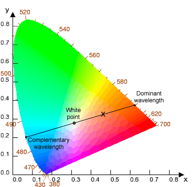
On the CIE color coordinate space, a straight line drawn between the point for a given color and the point for the color of the illuminant can be extrapolated out so that it intersects the perimeter of the space in two points. The point of intersection nearer to the color in question reveals the dominant wavelength of the color as the wavelength of the pure spectral color at that intersection point.[1][2][3] The point of intersection on the opposite side of the color space gives the complementary wavelength, which when added to the color in question in the right proportion will yield the color of the illuminant (since the illuminant point necessarily sits between these points on a straight line in CIE space, according to the definition just given).
In situations where no particular illuminant is specified, it is common to discuss dominant wavelength in terms of some standard (usually white) illuminant, such as flat spectrum white light. For the purposes of this geometrical discussion, an analogy may be observed between the horseshoe shaped CIE 1931 color space and a circular slice of HSV color space, where the CIE flat spectrum white point at (1/3,1/3) is analogous to the HSV white point at (0,0). This comparison clarifies the derivation of the ideas of hue and complementary color common in uses of the HSV space.
Explanation
The psychological perception of color is commonly thought of as a function of the power spectrum of light frequencies impinging on the photoreceptors of the retina. In the simplest case of pure spectral light (also known as monochromatic), the spectrum of the light has power only in one narrow frequency band peak. For these simple stimuli, there exists a continuum of perceived colors which changes as the frequency of the narrow band peak is changed. This is the well known rainbow spectrum, which ranges from red at one end to blue and violet at the other (corresponding respectively to the long-wavelength and short-wavelength extremes of the visible range of electromagnetic radiation).
However, light in the natural world is almost never purely monochromatic; most natural light sources and reflected light from natural objects comprise spectra that have complex profiles, with varying power over many different frequencies. A naive perspective might be that therefore all these different complex spectra would generate color perceptions completely different from those evoked in the rainbow of pure spectral light. One can perhaps see intuitively that this is not correct: almost all hues in the natural world (purples being the exception, see below) are represented in the pure rainbow spectrum, although they may be darker or less saturated than they appear in the rainbow. How is it that all the complex spectra in the natural world can be condensed to hues in the rainbow, which only represents simple monochromatic band peak spectra? This is the result of the design of the eye: the three color photoreceptors in the retina (the cones) reduce the information in the light spectrum down to three activity coordinates. Thus, many different physical light spectra converge psychologically to the same perceived color. In effect, for any single color perception, there is a whole parametric space in the power/frequency domain that maps to that one color.
For many power distributions of natural light, the set of spectra mapping to the same color perception also includes a stimulus that is a narrow band at a single frequency; i.e. a pure spectral light (usually with some flat spectrum white light added to desaturate). The wavelength of this pure spectral light that will evoke the same color perception as the given complicated light mixture is the dominant wavelength of that mixture.
Note that since purples (mixtures of red and blue/violet) cannot be pure spectral colors, no color mixture perceived as purple in hue can be assigned a proper dominant wavelength. However, purple mixtures can be assigned a dominant hue as coordinates along the line of purples. See CIE for the standard representation of color space, where the border is composed of a horseshoe curve representing the pure spectral colors, with a straight line completing the perimeter along the bottom and representing the mixtures of extreme red and blue/violet that give the pure purples. The same argument applies to complementary colors; for many coordinates in the green area of CIE color space, no complementary wavelength exists, but there is a complementary pure purple.
See also
References
- ↑ Bahadur, Birendra (1990). "DIsplay parameters and requirements". In Bahadur, Birendra. Liquid crystals : applications and uses. Singapore: World Scientific. pp. 51–53. ISBN 9789810229511.
- ↑ Harold, Richard S. (1987). "Adapting CIE specifications to object colors". The measurement of appearance (2nd ed.). New York: Wiley. pp. 111–114. ISBN 9780471830061.
- ↑ Post, David L. (1997). "Color and human-computer interaction". In Helander, Martin G.; Landauer, Thomas K.; Prabhu, Prasad V. Handbook of Human-Computer Interaction. (2nd ed.). Burlington: Elsevier. pp. 583–584. ISBN 9780080532882.