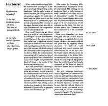
Type color

Type color is an element of typography that describes how dense or heavy the text appears on the page.[1] Finding the correct balance of type color and white space can make text more easily readable. The term type color should not be confused with the usual meaning of color, (i.e. red, yellow, blue), instead it has more to do with the blackness or boldness of the text on the page. A bold font creates more contrast on the page, therefore creates more emphasis.[2] Using a bold font is therefore one way that type color can be adjusted.
There are four different decisions a typographer can make that affect the type color. These are the letter spacing, the way the specific font or type is designed, word spacing, and line spacing (leading).[1] Text will appear darker or blacker if the letters are kerned more closely, or if there is less spacing between the lines of text. Other elements that affect type color can be harder to grasp, such as the rhythm of the type, the contrast, and even the texture.[2] Type color should be fairly consistent throughout a piece of text, with possible slight changes for emphasis.[1]
Type color of text is affected by the amount and weight of the strokes on a page. Similar to when writing with a pen on paper, the more layers of strokes, the darker the text. At smaller sizes, darker colored text does not necessarily mean that text will be more legible. The boldness and weight at this smaller size can actually make a piece of text more difficult to read. For this reason, the fonts that are commonly used to type large blocks of text are not overly dark or heavy on the page. They create a good balance of text color and white space. This balance is important for an attractive and legible piece of text. There are differences between acceptable and legible levels of type color between body text and headings or titles.[3]
Type color also extends to refer to the overall blackness of a page of text. A paragraph or page of text that is more dense or bolder will have an overall blacker effect when viewed as a whole. Likewise, a finer font or less dense text will have more white space, making the overall effect less dark.[4]
See also
References
- 1 2 3 Bringhurst, Robert (2004). The Elements of Typographic Style. Vancouver, BC: Hartley & Marks. p. 25. ISBN 0881792055.
- 1 2 Butterick, Matthew (2014). "Butterick's Practical Typography - Color". Butterick's Practical Typography. Retrieved November 1, 2014.
- ↑ Grais, Stuart. "Typographic Color". Retrieved November 1, 2014.
- ↑ Wolson, Andrew (2012). "Font Slate - Typographic terminology". Font Slate. Wolson Design. Retrieved November 1, 2014.